ShopDreamUp AI ArtDreamUp
Deviation Actions


Suggested Deviants


Suggested Collections


You Might Like…


![[Pokemon Neo World TCG] 005: Lugia-NEO](https://images-wixmp-ed30a86b8c4ca887773594c2.wixmp.com/f/37e73d8f-7013-42f6-94da-8b1ace9631a2/debs9cb-0312e570-de79-43db-a544-edee2bad2f69.png/v1/crop/w_184,h_184,x_0,y_19,scl_0.32857142857143/_pokemon_neo_world_tcg__005__lugia_neo_by_masteravalon_debs9cb-92s-2x.png?token=eyJ0eXAiOiJKV1QiLCJhbGciOiJIUzI1NiJ9.eyJzdWIiOiJ1cm46YXBwOjdlMGQxODg5ODIyNjQzNzNhNWYwZDQxNWVhMGQyNmUwIiwiaXNzIjoidXJuOmFwcDo3ZTBkMTg4OTgyMjY0MzczYTVmMGQ0MTVlYTBkMjZlMCIsIm9iaiI6W1t7ImhlaWdodCI6Ijw9NzkyIiwicGF0aCI6IlwvZlwvMzdlNzNkOGYtNzAxMy00MmY2LTk0ZGEtOGIxYWNlOTYzMWEyXC9kZWJzOWNiLTAzMTJlNTcwLWRlNzktNDNkYi1hNTQ0LWVkZWUyYmFkMmY2OS5wbmciLCJ3aWR0aCI6Ijw9NTYwIn1dXSwiYXVkIjpbInVybjpzZXJ2aWNlOmltYWdlLm9wZXJhdGlvbnMiXX0.jfmae0pxyiQD7ASEvyMuB-Wo6R44ayU9KLOb1pKVW8o)
![[Pokemon Neo World TCG] 005: Lugia-NEO](https://images-wixmp-ed30a86b8c4ca887773594c2.wixmp.com/f/37e73d8f-7013-42f6-94da-8b1ace9631a2/debs9cb-0312e570-de79-43db-a544-edee2bad2f69.png/v1/crop/w_92,h_92,x_0,y_10,scl_0.16428571428571/_pokemon_neo_world_tcg__005__lugia_neo_by_masteravalon_debs9cb-92s.png?token=eyJ0eXAiOiJKV1QiLCJhbGciOiJIUzI1NiJ9.eyJzdWIiOiJ1cm46YXBwOjdlMGQxODg5ODIyNjQzNzNhNWYwZDQxNWVhMGQyNmUwIiwiaXNzIjoidXJuOmFwcDo3ZTBkMTg4OTgyMjY0MzczYTVmMGQ0MTVlYTBkMjZlMCIsIm9iaiI6W1t7ImhlaWdodCI6Ijw9NzkyIiwicGF0aCI6IlwvZlwvMzdlNzNkOGYtNzAxMy00MmY2LTk0ZGEtOGIxYWNlOTYzMWEyXC9kZWJzOWNiLTAzMTJlNTcwLWRlNzktNDNkYi1hNTQ0LWVkZWUyYmFkMmY2OS5wbmciLCJ3aWR0aCI6Ijw9NTYwIn1dXSwiYXVkIjpbInVybjpzZXJ2aWNlOmltYWdlLm9wZXJhdGlvbnMiXX0.jfmae0pxyiQD7ASEvyMuB-Wo6R44ayU9KLOb1pKVW8o)


Featured in Groups


Description
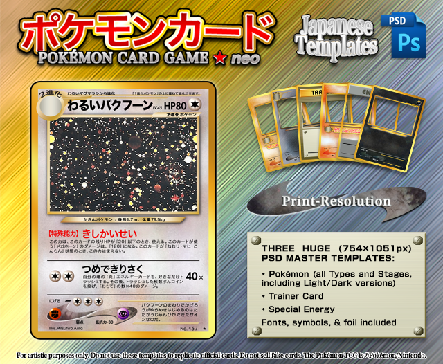
My new and improved Japanese Neo-series Pokémon card templates. I've always liked the layout of the Japanese Neo cards, but finding templates for them became difficult, impossible even, after Pokémon Zeo went down. I first attempted to make my own back in 2013, but they were pretty inaccurate (just okay-ish enough to sort of give off that J-Neo vibe).
I had been meaning to redo them for a while, but didn't get to it until three years later when a fellow faking buddy asked if I still had the PSD. I didn't, but I figured that would be a good opportunity to remake them as I had planned. Not only are these vastly more accurate, but they're print-resolution too! Great for printing high-quality customized cards. They're not without imperfections, but likely the best Japanese Neo templates you'll find on the web (as of the time of posting).
I encourage you to use your own artwork when faking, especially when uploading those fakes to DA. And please don't sell fake cards!
- - -
UPDATE 7 [Feb. 12, 2019]: Updated the Psychic and Fire textures, as well as their "boomerangs." (Fire's update isn't reflected in the preview image.) I also changed the resolution to 302 for more accurate print dimensions (they printed slightly too large at 300 DPI).
UPDATE 6 [Jul. 07, 2016]: Repaired a small gap in the art borders next to the Stage Tab and cut-off at the bottom of the Fighting texture. I also flattened all layer styles (Gradient Overlay, Drop Shadow, etc.) and blending modes to make the file more compatible with GIMP (although there may still be some bugs, like layers being in the wrong groups and text being rasterized). Now includes Set Symbol placement as well.
UPDATE 5 [Jun. 29, 2016]: Fixed the alignment of the Ability effect text (it was just slightly too far right) and added an OTF version of HiraKakuStd W8 for Windows users. Also updated the red for Pokémon Power label/name to match the shade from Notes/Tips.
UPDATE 4 [Jun. 22, 2016]: Apologies to anyone who has already downloaded the file. The Weakness/Resistance boomerangs were still bothering me a bit, so I've updated those. I also made the Fire and Psychic textures a little darker and added a glitter overlay for Neo3-style Shining Pokémon (where the art background used regular holofoil and the entire card is covered in a glittery laminate).
UPDATE 3 [Jun. 17, 2016]: I had used the English version of the Ultra Rare symbol, but the Japanese version is larger so I updated that. I also added a Shining foil for Neo Destiny-style Shining Pokémon (where the Pokémon themselves are embossed with foil).
UPDATE 2 [Jun. 16, 2016]: Added a holosheet (as well as a light, inverted one for the shadowy dots on non-foil areas).
UPDATE [Jun. 15, 2016]: Now includes a Special Energy template.
- - -
NOTES & TIPS (please read):
• It was made for Photoshop, so there will be problems when using it in GIMP instead
• Doesn't include Light/Dark Babies or Basic Energy
• Be sure to turn off the "Stage 2 Tail" layer when making Stage 1 cards
• Turn off the "Crown" layer for anything that isn't Darkness or Metal-Type
Grass, Water, Lightning, Fighting, Colorless, Metal: Red (#f00000)
Fire: Blue (#32409a)
Psychic, Darkness: Yellow (#ffdd00)
• You may need to copy/shift the placeholders around depending on how many attacks there are, how long an effect is, etc.
• The "Light" part of a Light Pokémon's name should be 9pt, yet "Dark" stays the same as the Pokémon's name
• Opponent (相手) and itself (自分) should be always be bolded in effect text
• Types, Special Conditions, and attack names in effect text should be typed inside hook brackets (「」)
• Special Energy colors tend to vary by card, so feel free to change up the colors to better suit your art
• Foil (regular) should generally be applied with a Multiply blending mode (70% opacity), but you may have to play around with it depending on the background
• The foil shadow should be pasted above all layers with a Multiply blending mode (100% opacity)
• Shining foil should be clipped to the Pokémon with two layers: Multiply (70% opacity) and Color Dodge (40-100% opacity)
• Shining "glitter" should be pasted above all layers (including foil shadow) with a Screen blending mode (10-100% opacity depending on desired intensity)
• If punctuation, brackets, or parenthesis begin or end on a line of text, they may appear shifted too far right or left. You may be able to fix this by highlighting that character and changing the kerning (in the Character panel) to Metrics.
• If a line begins with punctuation or a closing bracket/parenthesis, increase the tracking (in the Character panel) of the entire textbox by increments of 1 until it doesn't (you might want to use the same settings for other effect boxes for consistency)
• Let me know if I should add anything else to these notes!
If you're unsure about placements (in case you have to move anything), use official cards as a reference.
- - -
Thanks to ILKCMP for the Type orbs (recolored to better match the Japanese textures) and neo-cscdgnpry for the push I needed to start these.
The Pokémon TCG is Copyright Pokémon/Nintendo.
I had been meaning to redo them for a while, but didn't get to it until three years later when a fellow faking buddy asked if I still had the PSD. I didn't, but I figured that would be a good opportunity to remake them as I had planned. Not only are these vastly more accurate, but they're print-resolution too! Great for printing high-quality customized cards. They're not without imperfections, but likely the best Japanese Neo templates you'll find on the web (as of the time of posting).
I encourage you to use your own artwork when faking, especially when uploading those fakes to DA. And please don't sell fake cards!
- - -
UPDATE 7 [Feb. 12, 2019]: Updated the Psychic and Fire textures, as well as their "boomerangs." (Fire's update isn't reflected in the preview image.) I also changed the resolution to 302 for more accurate print dimensions (they printed slightly too large at 300 DPI).
UPDATE 6 [Jul. 07, 2016]: Repaired a small gap in the art borders next to the Stage Tab and cut-off at the bottom of the Fighting texture. I also flattened all layer styles (Gradient Overlay, Drop Shadow, etc.) and blending modes to make the file more compatible with GIMP (although there may still be some bugs, like layers being in the wrong groups and text being rasterized). Now includes Set Symbol placement as well.
UPDATE 5 [Jun. 29, 2016]: Fixed the alignment of the Ability effect text (it was just slightly too far right) and added an OTF version of HiraKakuStd W8 for Windows users. Also updated the red for Pokémon Power label/name to match the shade from Notes/Tips.
UPDATE 4 [Jun. 22, 2016]: Apologies to anyone who has already downloaded the file. The Weakness/Resistance boomerangs were still bothering me a bit, so I've updated those. I also made the Fire and Psychic textures a little darker and added a glitter overlay for Neo3-style Shining Pokémon (where the art background used regular holofoil and the entire card is covered in a glittery laminate).
UPDATE 3 [Jun. 17, 2016]: I had used the English version of the Ultra Rare symbol, but the Japanese version is larger so I updated that. I also added a Shining foil for Neo Destiny-style Shining Pokémon (where the Pokémon themselves are embossed with foil).
UPDATE 2 [Jun. 16, 2016]: Added a holosheet (as well as a light, inverted one for the shadowy dots on non-foil areas).
UPDATE [Jun. 15, 2016]: Now includes a Special Energy template.
- - -
NOTES & TIPS (please read):
• It was made for Photoshop, so there will be problems when using it in GIMP instead
• Doesn't include Light/Dark Babies or Basic Energy
• Be sure to turn off the "Stage 2 Tail" layer when making Stage 1 cards
• Turn off the "Crown" layer for anything that isn't Darkness or Metal-Type
• After inverting the art shadow for Darkness, reduce the opacity to 90%
• Pokémon Power color varies by Type (hex values are just guesstimates):Grass, Water, Lightning, Fighting, Colorless, Metal: Red (#f00000)
Fire: Blue (#32409a)
Psychic, Darkness: Yellow (#ffdd00)
• You may need to copy/shift the placeholders around depending on how many attacks there are, how long an effect is, etc.
• The "Light" part of a Light Pokémon's name should be 9pt, yet "Dark" stays the same as the Pokémon's name
• Opponent (相手) and itself (自分) should be always be bolded in effect text
• Types, Special Conditions, and attack names in effect text should be typed inside hook brackets (「」)
• Special Energy colors tend to vary by card, so feel free to change up the colors to better suit your art
• Foil (regular) should generally be applied with a Multiply blending mode (70% opacity), but you may have to play around with it depending on the background
• The foil shadow should be pasted above all layers with a Multiply blending mode (100% opacity)
• Shining foil should be clipped to the Pokémon with two layers: Multiply (70% opacity) and Color Dodge (40-100% opacity)
• Shining "glitter" should be pasted above all layers (including foil shadow) with a Screen blending mode (10-100% opacity depending on desired intensity)
• If punctuation, brackets, or parenthesis begin or end on a line of text, they may appear shifted too far right or left. You may be able to fix this by highlighting that character and changing the kerning (in the Character panel) to Metrics.
• If a line begins with punctuation or a closing bracket/parenthesis, increase the tracking (in the Character panel) of the entire textbox by increments of 1 until it doesn't (you might want to use the same settings for other effect boxes for consistency)
• Let me know if I should add anything else to these notes!
If you're unsure about placements (in case you have to move anything), use official cards as a reference.
- - -
Thanks to ILKCMP for the Type orbs (recolored to better match the Japanese textures) and neo-cscdgnpry for the push I needed to start these.
The Pokémon TCG is Copyright Pokémon/Nintendo.
© 2016 - 2024 icycatelf
Comments31
Join the community to add your comment. Already a deviant? Log In
sorry this might sound like a really noob question but i cant seem to find the holo foil? where is it located?